

“Like a good neighbor, State Farm is there.”
The State Farm tagline — like so many advertisements — does more than connect with new customers. It also convinces existing customers that they made the right choice in choosing State Farm for their insurance.
The same is true about delivering data to your customers. Reporting is more than a feature of your product; it is an opportunity to remind customers of the value your solution provides.
Some product companies understand this concept well. For example, Spotify’s Wrapped is an annual report sent to listeners to summarized their music habits. It is a delightful journey through personalized data and a reminder of how much you have enjoyed the service throughout the year.

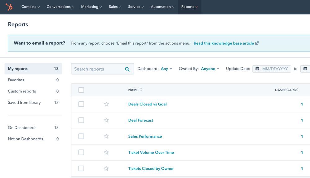
Spotify is more the exception than the rule. Hubspot reports are literally the very last thing (last drop down, last item) you can find in the Hubspot UI. Here’s a more typical example of Hubspot’s reporting:
What if Hubspot’s reporting had more ambitious goals than a simple data access interface? What if it defined the pressing questions that many users should care about and drew a direct line to answers?
A better form of reporting wouldn’t necessarily require different data as much as a user-oriented mindset. It would combine utility with a story that reinforces the value of the product. We are getting closer to “data storytelling” when we use data to convey insights and a message. My definition of data storytelling is:
The presentation of data to communicate a message using the techniques of traditional narrative forms.
How customer reporting can make a difference for your product
Customer reporting is an under-utilized tool for product leaders. Let’s examine the ways that it can build customer relationships:
1. Establish a language
You are the expert on your product and the data it captures. What metrics are you going to emphasize? What behaviors do you want to encourage? Reporting is your opportunity answer these key questions and define what matters.
Twitter is encouraging activity by making their first reported measure ‘number of Tweets'.

2. More touch-points, more better
Staying top-of-mind is critical for product success. Reporting is a chance to deliver a high-value piece of information to your customers — and remind them you exist.
FullStory delivers a weekly digest to my inbox that reminds me to check our engagement numbers.

3. Differentiate your solution
You will set your product apart from the competition when you make your data a valuable part of your solution.
Lunas Consulting (“Sales as a Service”) recognizes that reporting on the sales activity and wins is a critical part of their client value. They have designed a Juicebox report that provides an interactive exploration of weekly and historical results.

4. Understand the value drivers of your business
One of the under-appreciated elements of reporting is that it requires you to evaluate what activity is important (and what is not). You have to understand where your customers get value. This understanding can then impact your product development decisions. You will understand the drivers of your business better than ever.
Frameworks like the “North Star Metric” force a product organization to understand the key measures of customer value. You want to consider how your product success aligns with the value your customer sees, and how that is displayed in reporting.
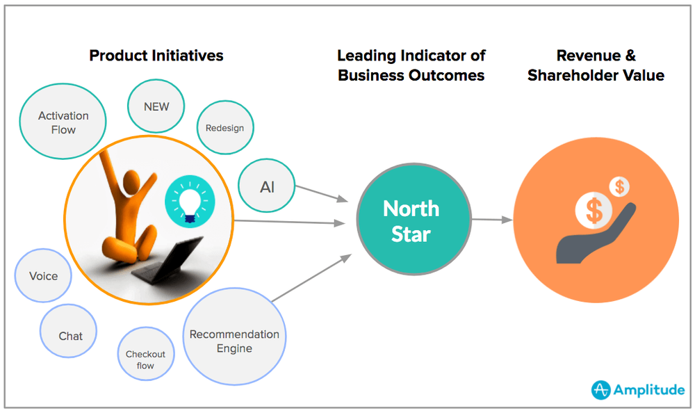
credit: https://amplitude.com/blog/product-north-star-metric
Reporting requires managing a careful balance of conveying a message about your value with the transparency and hard-reality of data.
How data storytelling can help
Traditional reporting is not great at connecting with non-analytical audiences. It tends to come in one of two forms: 1) The one-page dashboard that tries to compress as much data as possible into a small space; 2) The raw data table that makes no attempt to presenting the data in a way that might reveal insights.
In contrast, a data storytelling approach takes responsibility for communicating and engaging the audience. How?
It’s not about you, it’s about them.
You need to start with your audience in mind. The audience is the people who are going to do something with your insights and analysis. If you want them to change their behavior or decisions, you need to understand their motivations. What are their priorities? How do they best absorb data? What actions can they take?
In my recent presentation entitled ‘The Star Trek Guide to Better Analytics’, I found Dr. Bones McCoy to be a good characterization of your audience: he’s not an engineer (or data-savvy), he’s skeptical, and he’s people-oriented. But every audience is different. Check out our Data Personality Profile for a framework for evaluating your audience.

Data Storytelling is Writing
I hate to take you back to your writing classes but data storytelling isn’t just a collection of data visualizations, it is a form of writing. You are building a narrative that makes an argument.
Your narrative structure should start by posing the problem and context, followed by your analysis, and finally your conclusion. In a data story, we like to use the three-act story structure.

Furthermore, the actual act of writing will help you explain your thinking. Before worrying about visualizing data, create a written version of your data story that walks through the logical flow. Exercises like this can help you focus on your message.
Be Simple and Specific
When you are presenting data to your audience, your priority is to make it easy to understand and easy to connect to.
Simple to understand means using charts and visualizations that are intuitive and well-understood. I love an exploratory treemap or network diagram or Sankey chart. But each of these advanced visualizations requires your audience to learn how to read them. We’ve found that it is far better to stick to charts that have a lower “barrier to entry.”
You also want to explain the data and insights in ways that connect emotionally or logically. Often this means providing specific examples. After all, “specificity is the soul of narrative.” In addition, you want to look for ways to make your data relatable.
One of the all-time best specificity examples is the Gun Deaths visualization created by Periscope.

Package for consumption
Finally, how your data story gets delivered really matters. A lot. Some people want the ability to interactively dig into the details. Others just want the key message, and to have it delivered to their inbox.
- What is the delivery method that will most likely grab your audience’s attention?
- How much explanation and in-person hand-holding is necessary?
- Is the data story a collaboration or a one-way broadcast?
Beyond the delivery method, we have also found that the visual design of your data story is important. If you’re not a designer, how do you make something that looks beautiful, clean, and clear? Start by removing the ‘chart junk’, all the visual elements that distract from the data. Then consider whether you’ve used color carefully, made smart font choices, and used layout to guide the reader.
Where to get started
Those are some of the basic concepts that will get you started toward presenting data as a compelling story. Of course, there is a ton more to learn. That’s why we’ve been creating learning content that we hope will teach a new generation of data storytellers. Here’s where I’d recommend you go next:
- Learning from the best with 20 outstanding data storytelling examples
- Dive deeper with our Complete Guide to Data Storytelling
- Practice your skills with the only build-it-yourself data storytelling platform
If you enjoyed this post, join our community of no-code founders for free.
We are the world's largest no-code community. Helping founders and businesses grow faster with the power of no-code.